How local journalists can map COVID-19 cases
The Coronavirus outbreak is a fast-moving story for any newsroom to cover, particularly for local reporters trying to help their readers make sense of what’s happening in their area. And for those local reporters wanting to show their readers where cases are, the options for an embeddable local coronavirus map are limited and time-consuming.
So Stanford University’s Big Local News and Pitch Interactive—with support from the Google News Initiative—created theCOVID-19 Case Mapper to make it possible for local journalists to easily embed up-to-date Coronavirus map visualizations on their sites for readers.

COVID-19 Case Mapper project, which shows cases mapped against population
This is the first project of a recently-announced partnership to launch a global data resource for reporters working on COVID-19. In partnership with the Google News Initiative, the JSK Journalism Fellowships at Stanford University and the Big Local News group will aggregate data from around the world and help journalists tell data-driven stories that showcase local information.
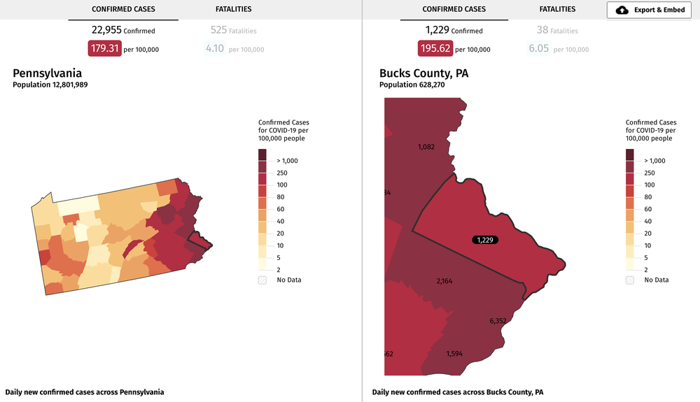
Unlike other coronavirus case maps, the Case Mapper project allows local reporters to embed a map of their area or even the national case map. The map shows cases in relation to population—it’s colored by numbers of cases per 100,000 people, and shows you the severity of outbreak by the number of people in each region, making it easier to compare where you live to the country as a whole.

Map of cases in one county in Pennsylvania, compared to cases state-wide
The data is from the New York Times’ recently-published open COVID-19 county dataset and the first version of the map, launched today, will be U.S.-onlyk, with a global edition to come soon. Any newsroom or website can easily embed each version of the map, helping journalists bring this global story to their local readers.
by Simon Rogers via The Keyword
Comments
Post a Comment