Do more with Data Studio Community Visualizations
Data Studio Community Visualizations, currently in beta, allow you to create and integrate custom JavaScript components into your dashboards. You can use Community Visualizations to expand your chart selection, customize your report styling, or create custom components that perform advanced analysis or even in-browser machine learning.
New galleries for Data Studio Community Visualizations
Showcase gallery for Community Visualization reports
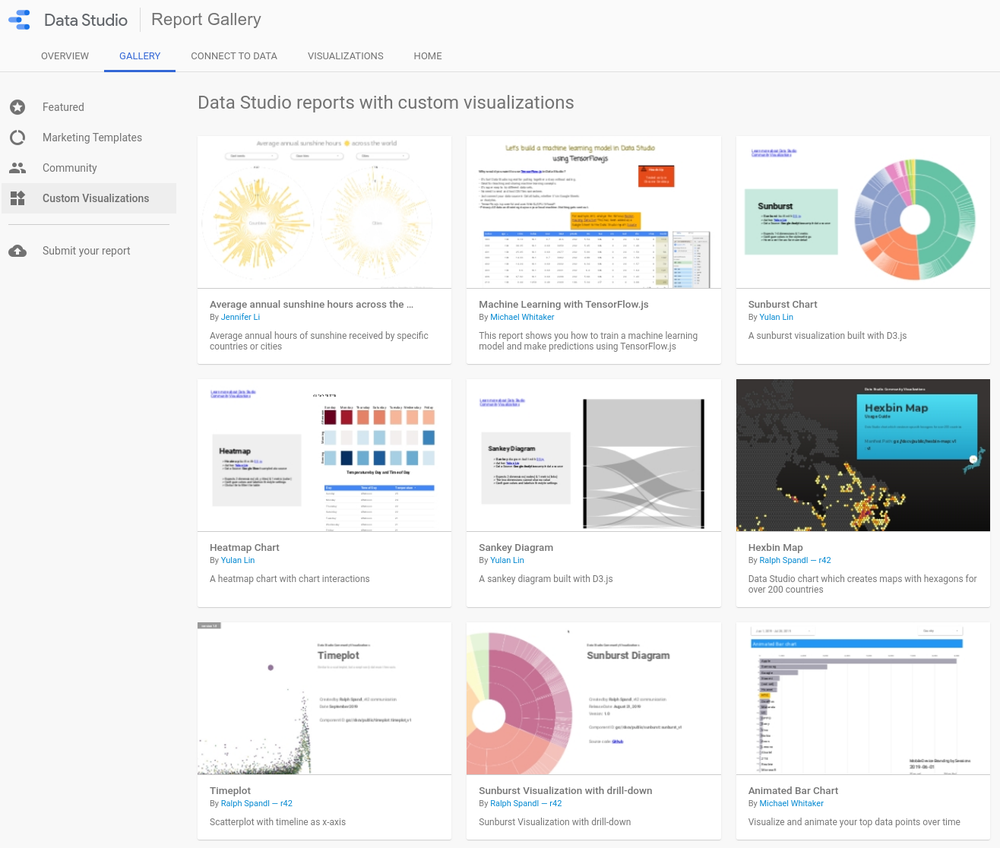
The Data Studio team recently launched the Community Visualization Report Gallery.
There, you can explore how others in the community have leveraged Community Visualizations to make the most of their data and dashboards.

Reports featuring Community Visualizations
Public Partner Visualization Gallery
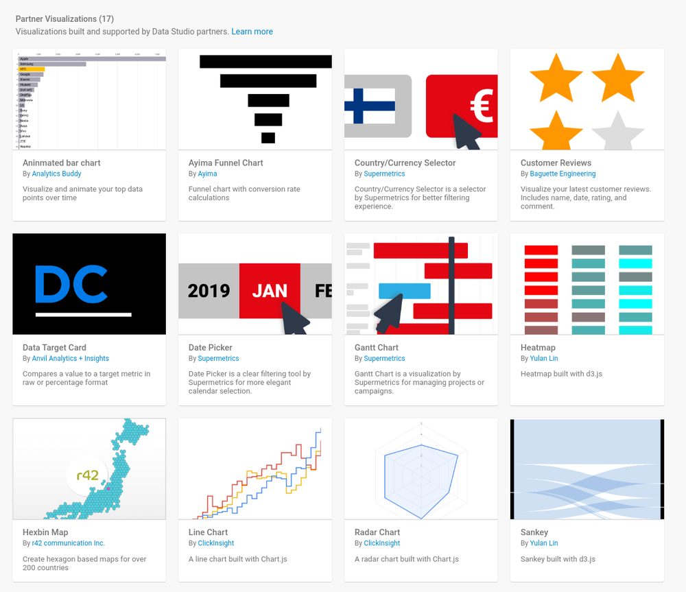
Additionally, we’ve added a new gallery of Partner Community Visualizations that we’ve made available. Browse them in the new Data Studio Visualizations gallery.
The Data Studio Visualizations Gallery
Click-to-add Partner Visualizations
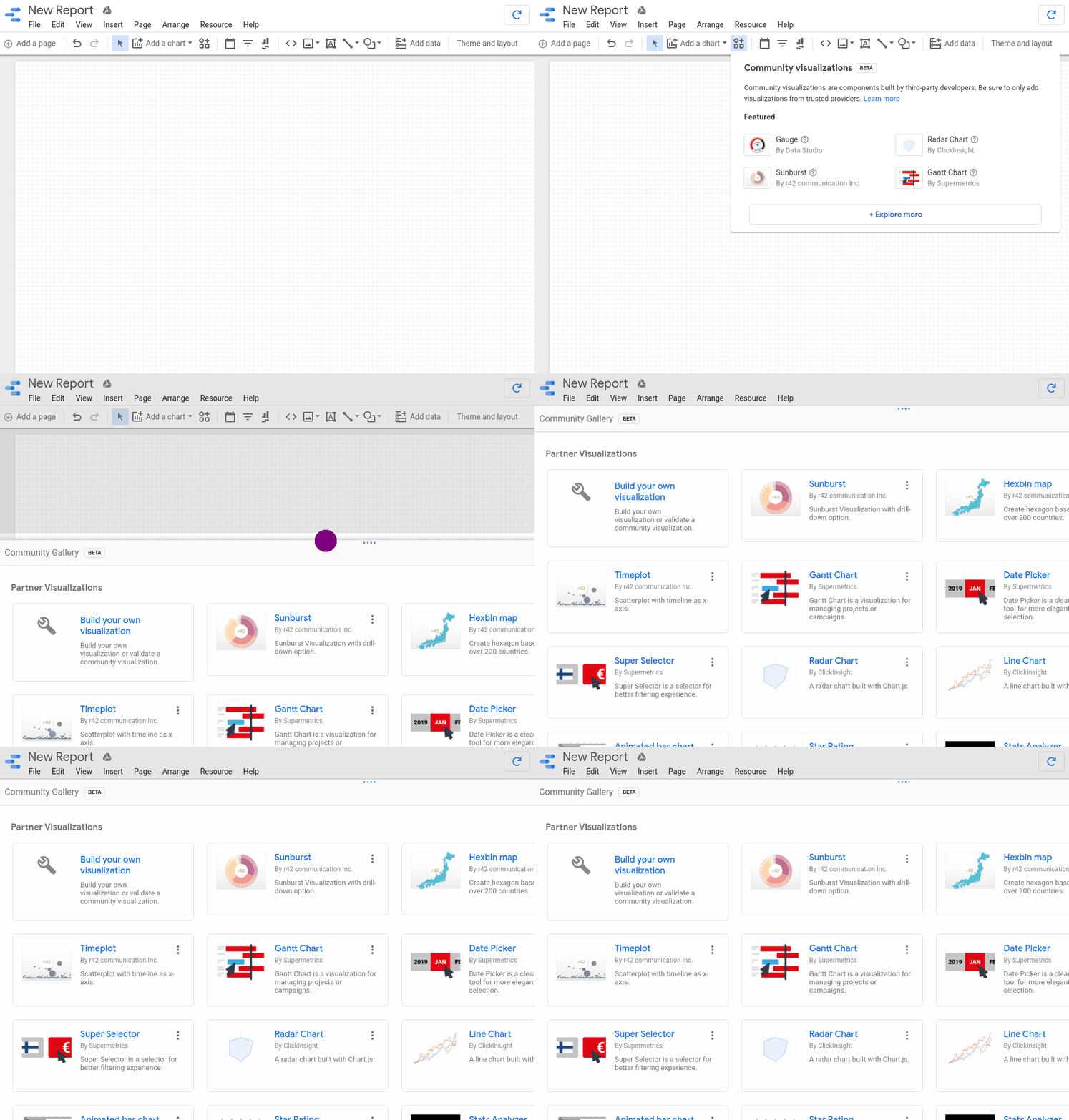
To add these Partner Visualizations to a report, click “Explore more” in the Community Visualizations drop down. There, you can browse and install a variety of partner-built charts, including funnel visualizations and Gantt charts.

The new in-product Partner Visualization gallery
Community Visualizations can add to a Data Studio dashboard in different ways - from providing custom charts and styling to integrating calculations with reporting.
Statistical analysis with Community Visualizations
Anvil Analytics + Insights works to bring data-driven decision making to all of their work, including optimized paid media campaigns. They used Community Visualizations to build their own Chi-Square statistical analyzer.
Several Anvil customers noticed that channels in Google Ads and Analytics converted at different rates, and wanted to know if the variance in conversion rates was statistically significant.
Prior to using Community Visualizations, the Anvil Insights team manually exported the data out of Google Analytics into a separate tool, then ran the statistical analysis. Depending on where Anvil ran the analysis, the results were either stored separately from their reports, or not stored at all. Every time they wanted to test a different hypothesis or run a different variation of the test, they had to repeat the same time-intensive process.
In order to speed up hypothesis testing and integrate the tests and results into Data Studio reports, Anvil used Data Studio Community Visualizations and built a Chi-Square calculator within a week.
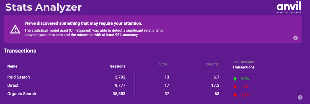
Anvil’s calculator takes in data, just like any Data Studio chart. Once the calculation is complete, the analyzer presents the statistical significance, and either calls the viewer’s attention to a relationship in the data, or comments that there was nothing of note in the data. Now, all it takes to test new hypotheses is switching out the data for the component, just like you would for any other Data Studio chart. See it live.

Anvil Analytics + Insights Community Visualization Chi-Square Calculator
“This has been a much faster way to find statistical significance in our campaigns and in other hypotheses we want to test. Anvil’s Director of Analytics and Decision Science, Brett Lohmeyer says, “The best part is that it gives us an easy way for our team to better communicate the value of using statistical significance to our clients.”
Try it yourself
Check out the new in-product Partner Visualizations Gallery to browse and add new partner-built Community Visualizations to your reports. To build your own Community Visualizations, check out the developer documentation.by Yulan Lin via The Keyword
Comments
Post a Comment